Data Taste
Estimated time to complete: 45 minutes

Estimated time to complete: 45 minutes
This module will introduce the learner to corals as both reef-building organisms and natural archives of ocean climate history. Learners will examine coral growth bands, use digital tools to measure and extract data from images of coral cores, and transfer those measurements into spreadsheets for analysis. Through this process, students connect biological structure to environmental change while practicing core ocean literacy and data literacy skills, including observation, measurement, data organization, and interpretation. To build this foundation, you will begin by exploring how reefs form and grow over time.
Take a look at these videos:
How Do Corals Build Reefs?
https://www.youtube.com/watch?v=nBO7zWO1zXY
What Do Corals Tell Us About Changing Climates
https://www.youtube.com/watch?v=cAGOocHrwY
ImageJ is a free software tool that can be used to translate lengths measured on images to real-world measurements. It is commonly used to gather data about marine animals, including fish, mollusks, crustaceans, and corals. Researchers can use this software to analyze body lengths, shell sizes, or other structural features of marine organisms for studies related to growth, population dynamics, or ecological assessments.
This module can be run through the web-base tool, but we recommend the free download Desktop tool for this module.

If you encounter issues installing ImageJ software, please see the MacOS guide https://imagej.net/ij/docs/install/osx.html
or Windows/Linus guides https://imagej.net/ij/docs/install/index.html
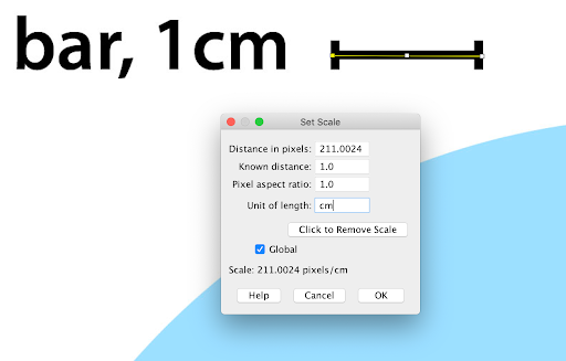
Once the ImageJ software has been downloaded to the desktop, a number of functions can be utilized. Calibration in ImageJ is the process of establishing the relationship between pixel dimensions in a photograph and real-world measurements. The image is calibrated using a known measurement, usually contained within a scale bar of the image.
Download the practice image and save it to a known location with the title of “cal_practice_image”.
Your answer:
Within ImageJ go to “File” located in the far left of your toolbar and select File → Open. Navigate to the cal_practice_image.jpg that you have saved to open this file within ImageJ.
Next, navigate the toolbar to select the straight line tool ![]() and select.
and select.

Next, go to the toolbar and select the straight line tool ![]() .
.
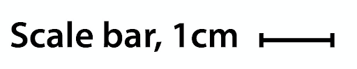
Next navigate back to the toolbar to Analyze → Set Scale. This feature will take the number of pixels that make up the line of the scale and equate this with a known distance. The known distance from the scale bar is 1cm and the distance in pixels should range between 200 and 220 pixels. Ensure the known distance is set to “1” and the unit of length is cm, or the unit that is listed in the scale bar. Tick the box marked “global” which will save this scale until the user updates it. Distances in pixels will vary slightly between individuals but should be within a range of +/- 10 pixels.
Take a few minutes to practice using the scroll, line, and magnifying glass tools before proceeding to the next step.
 | The magnifying glass tool on the toolbar can be utilized for zooming into the coral growth band for the most accurate measurement. | |
 | The scrolling hand tool on the toolbar can be used to additionally move the image from year to year. | |
 | Ensure to switch back to the line tool to make the measurement. |
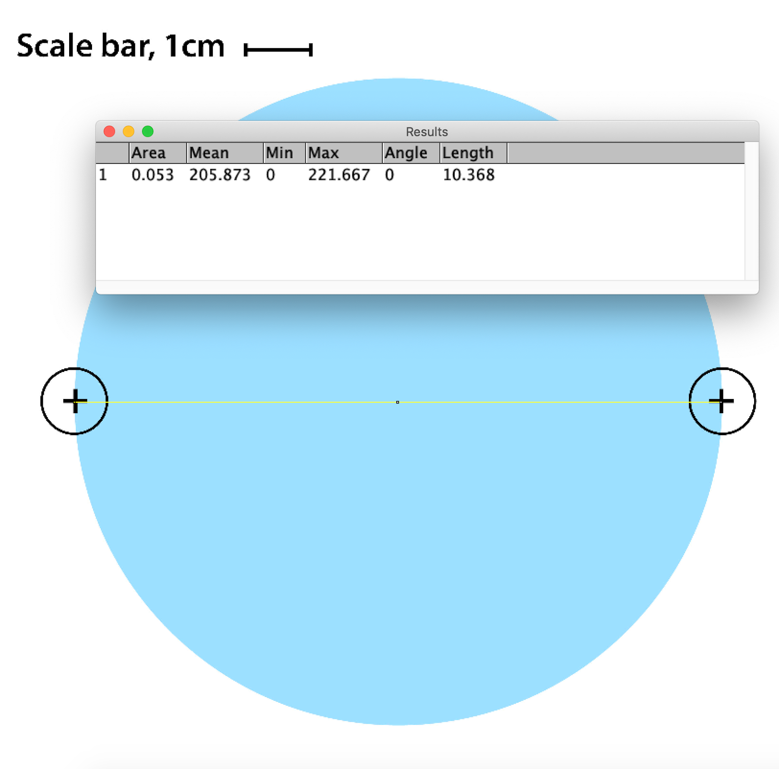
Once the scale has been set, practice measuring the diameter of the circle in the image.
The diameter of a circle is the straight line segment that passes through the center of the circle and connects two points on its boundary. It is the longest straight line that can be drawn inside the circle. In the image below, the endpoints of a diameter of the circle are each marked with a “+” symbol.

Navigate back to the cal_practice_ image.jpg opened within ImageJ and using the straight line tool, draw a line across the diameter of the circle, connecting the “+” symbols. Next, select Analyze→ Measure. A row of cells will print in the Results table with the final data column containing the length measurement. The length column will record the diameter of the circle in centimeters based on the scale bar measured in the original image.
Practice measuring the diameter several times, practice zooming into the image to garner a more accurate measurement. Keyboard shortcuts can be utilized for repeated measurements. The diameter of the circle should fall between 9.200 and 10.500 cm if the scale in Step 2 has been set correctly.
A coral growth band is a visible layer of calcified skeletal material deposited by corals over time, indicating periods of growth.

Image credit: https://climatehistory.com.au/palaeoclimate/coral-2/
Coral growth bands are similar to tree rings and show how much a coral has grown over a year. Coral skeletal growth extension can be influenced by many abiotic factors that can have seasonal variation. Coral growth bands can be used to understand the health of coral reefs and how they respond to seasonal changes in their environment.

To conduct an investigation into coral growth bands, download the coral core image to process growth band data and save to a known place. The file name to save is “coral_core_growth_band" Open the downloaded file in ImageJ.
Your answer:
Whenever you begin to analyze a new image in ImageJ, you will need to confirm the calibration. Navigate to Analyze → Set Scale and repeat the process outlined in Step 2.
Ensure the known distance is set to “1” and the unit of length is cm. Tick the box marked “global” and click “OK” which will save this scale until you update it again.
If not in range, it may require a return to the beginning of Step 5.

Once the scale is set each year can be measured separately by utilizing the Analyze → Measure function. Take twelve measurements, one for each year, starting with 2005. Begin at the base of the coral core (year 2005) and proceed upward, measuring each annual band sequentially in chronological order toward the most recent year (2016).
| The magnifying glass tool on the toolbar can be utilized for zooming into the coral growth band for the most accurate measurement. | |
| The scrolling hand tool on the toolbar can be used to additionally move the image from year to year. | |
| Ensure to switch back to the line tool to make the measurement. |

To transfer the data into Google Sheets or Microsoft Excel you will need to copy and paste the data from the table or save the table a .csv file and import it. To copy the data, highlight the data in the table, navigate to top toolbar to Edit → Copy and then open a Google Sheet or .xls worksheet and select Edit → Paste.
Note: Copy and paste may not work in the web-based version of ImageJ. To transfer your data, select File → Save As in the Results window and save the file as a .csv. Open the file in Excel or upload it to Google Sheets.
Replace the 1–12 values with the corresponding years (2005–2016), since each measurement represents one year of growth. To fill a series in Google Sheets, enter the first two values to create a pattern 2005 and 2006, highlight both cells, then drag the fill handle down so Sheets automatically continues the sequence to 2016.
| Year | Length (cm) |
| 1 | 0.72 |
| 2 | 1.00 |
| 3 | 0.89 |
| 4 | 0.81 |
| 5 | 0.96 |
| 6 | 0.98 |
| 7 | 0.76 |
| 8 | 0.80 |
| 9 | 0.79 |
| 10 | 0.81 |
| 11 | 0.79 |
| 12 | 0.85 |
ImageJ generates multiple measurements, but for this activity you only need the Year and Length (cm) columns, which represent annual coral growth. Once you have created your table in Google Sheets or Microsoft Excel, delete the other columns to keep your dataset focused on the variable that answers the research question.
Now, replace the Year values (1–12) with the corresponding years (2005–2016); each measurement represents one year of growth. To fill a series in Google Sheets or Microsoft Excel, enter the first two years (2005 and 2006) to create a pattern, highlight both cells, then drag the fill handle down to automatically continue the sequence to 2016.
Your data sheet should now have Column A labeled Year and Column B labeled Length (cm). Edit the label for Column B to say Annual Length (cm) = Growth. Now you will make some simple calculations with the data.
Each calculation made below will be within a cell (e.g. B16). A cell is a small box, coded by letter and number where data is entered. In some cases, a command can be used to work with the data. To enter a command within the cell, start by typing an “=” sign and you will see a list of commands appear in the Formulas Bar, located above the data and indicated by fx. You can scroll through the list of commands to find and select the one that you want. If a cell contains a formula, the Formula Bar will display the full formula, while the cell will show the result.
In Column A, in cells A15 and A16, insert labels for the average and maximum of the data, AVERAGE() and MAX(), which will be calculated in cells B15 and B16.

Add the below formulas to the spreadsheet in Column A to be calculated in Column B (B15-B19)
| Year | Annual Length (cm) = Growth |
|---|---|
| 2005 | 0.764 |
| 2006 | 1.122 |
The AVERAGE function in Excel is used to calculate the mean of a set of numbers or values. It adds up all the numbers in a given range and then divides the sum by the total number of values in that range. The “=” sign indicates in Excel that a function is being utilized. The function AVERAGE is entered and next an open parenthesis is added “(“ . The user can then highlight all of Column A and then close the parentheses “)” and hit “Enter”.
Enter the formula to calculate the average annual growth of the coral into cell B15.
![]()
=AVERAGE(A2:A13)
The MAX function is used to find the largest (maximum) value in a range of numbers. To search Column A for the largest value, or in this case, the maximum growth year, enter the following function in the fx. The “=” sign indicates in Excel that a function is being utilized. The function MAX is entered and next an open parenthesis is added “(“ . The user can then highlight all of Column A and then close the parentheses “)” and hit “Enter”.
Enter the formula to calculate the maximum annual growth of the coral into cell B16.

=MAX(A2:A13)
To create a bar graph in Google Sheets or Microsoft Excel, first highlight both columns of your dataset, including the headers for Year (2005–2016) and Annual Growth (cm). Click Insert in the top menu and select Chart; the chart will be generated automatically. If it does not default to a bar graph, open the Chart Editor panel on the right, select the dropdown under Chart type, and choose Column chart. Confirm that the Year data appears on the horizontal (x) axis and Annual Length (cm) = Growth appears on the vertical (y) axis; if needed, adjust this in the Setup tab of the Chart Editor.
Finally, add a clear chart title (e.g., Coral Growth by Year). To add a title to your graph in Google Sheets, first click on the chart to open the Chart Editor panel on the right side of the screen. Click the Customize tab, then open Chart & axis titles. In the dropdown menu, select Chart title and type your graph title.

Your answer:
Coral core data are powerful climate archives because coral skeletons record environmental conditions as they grow. The core analyzed in this lesson was collected from Gili Selang, Indonesia, a region influenced by monsoons, ocean currents, and large-scale climate patterns.
Which abiotic factors are most likely to influence coral growth in this region? Explain how one factor could increase or decrease annual growth.
If you observe a year with unusually low coral growth in your graph, what environmental changes might explain that pattern?
How does this coral core record illustrate the connection between the ocean and climate over time?
https://www.whoi.edu/oceanus/feature/how-do-corals-build-their-skeletons/
https://www.ncei.noaa.gov/news/how-can-corals-teach-us-about-climate
https://agupubs.onlinelibrary.wiley.com/doi/full/10.1029/2018PA003387
https://www.sciencedirect.com/science/article/abs/pii/S0031018223001062
